One of the other teachers at the international calligraphy conference was Victoria Pittman who just gave us a little heads-up here. She has posted photos of some of the work from her week-long class on "Flowers and Flourishes", using broad-edge brush techniques in watercolor, and incorporating lettering.
Her piece in the faculty show (similar to another she has just posted) was a dramatic assemblage including a calligraphic, gestural sort of... object. Maybe made of acrylic, I'm thinking. We had a fun collage class with her some years ago at the Siena Center in Racine, where she showed us wildly mixed media techniques, building up layers of materials, various metal-leafing and patinas. During our breaks in that class she got us down on the lakefront picking up bits of rusted metal to incorporate into assemblages. There's treasure everywhere!
Tuesday, August 28, 2007
Friday, August 24, 2007
Cherryl Moote
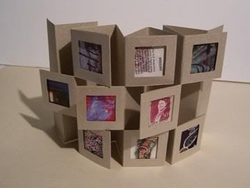
The week of the international calligraphy conference, the last two days I had a class with Cherryl Moote, based on her book Sleight of Binding. We made accordion book models, flexagons, jacob's ladders, and these gallery books -- actually three days' worth of books, that we tried to get into two days. Cherryl has a great website with lots of photos. Her packed instruction books have the clearest line drawings I have seen for actually making these complicated sort of structures, although they don't have the eye-candy appeal of the glossy photo books.
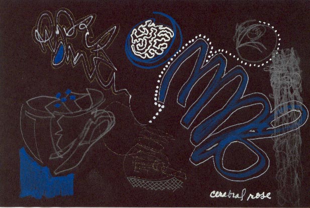
I call this "My World Is Full of a Number of Things" because it includes painting, lettering, origami paper, found papers, paste paper, stamping, and postage.
She also gave one of most inspirational of evening slide lectures, on the subject of finding your own voice. What a great teacher!
I call this "My World Is Full of a Number of Things" because it includes painting, lettering, origami paper, found papers, paste paper, stamping, and postage.
She also gave one of most inspirational of evening slide lectures, on the subject of finding your own voice. What a great teacher!
Joseph Cornell
Joseph Cornell's work catches your attention and draws you in to take in the details of the sculptural assemblage boxes he created. They are truly wonderful. He had a wonderful eye for detail and design. A very inspiring artist.
Friday, August 17, 2007
Melissa Manley
A true labour of love, look what goes into making a copper vessel. Melissa's work is wonderfully innovative. Be sure to look at the "gut" vessel with iron wire. Her site is a treat!
Monday, August 13, 2007
Friday, August 10, 2007
Illustration Friday
Feeling a little stuck in making art? Need a jump start? Each week Illustration Friday posts a challenge, make a cup of tea and read on........
Mark Rothko

Irritated with myself that I missed the piece on PBS about Mark Rothko. I was reading a book by Mary Todd Beam, where she describes seeing an original Rothko in someone's home. I believe she said the room was dark except for a light on the painting. As she walked by she said "it looked like the painting was breathing". Rothko's later works have large blocks of color that almost seem to speak to each other. Color is so powerful. We here in Milwaukee are fortunate to have a Rothko at the Milwaukee Art Museum.
Wednesday, August 8, 2007
Artful Blogging

This is a "must have" publication. A few of my daily checkins (Nina Bagley, Misty Mawn, Judy Wise) are featured. Fabulous photography of art and inspiring words. I can't put it down, it's a great read. Go get yourself a copy and pour a cup of tea. I promise you'll get totally lost in it!
Tuesday, August 7, 2007
Self Portrait Challenge
SPC is definitely something to check out. There is a challenge posted each week. You can find all the details if you're interested in participating. Very creative photos!
Monday, August 6, 2007
Mary Beth Shaw
Saturday, August 4, 2007
Thomas Hoyer
This is Jae, back from the international calligraphy conference which was held on Vancouver Island this year. The conference is usually divided into two study sessions, with a break in the middle. The participants have the choice of several dozen teachers, and can spend both sessions with one teacher, or divide their week between two different teachers, in a the huge variety of subjects. It was my thirteenth conference, over last fifteen years or so.
Vancouver Island is one of the best places I've ever been to: nearly as beautiful as Skye, but with excellent mild weather. The campus at Shawnigan Lake this year was pretty good -- a posh prep school that was the most handicapped-inaccessible institution I have ever seen, although the landscaping was lovely, the new dorms comfortable, staff enthusiastic hosts, and the food excellent.
This year I first had three days with Thomas Hoyer, studying a Fraktur hand. This is descended from medieval blackletter but has been elaborated into many typefaces, particularly in Germany, where books are traditionally printed in the style. A thick blackletter falls naturally from the broad-edge pen, and was the first thing I tried when I bought my first Speedball nib. I've spent a bit of time over the last mumble-mumble years practicing a primitive version of it, but this was something entirely new. I mean every stroke was different from the alphabets I've learned to write before. You're only fooling yourself to think you can learn a new alphabet in three days, but the first day we got through the entire lower-case, which was grueling. I had no muscle memory for this, and would frequently get lost in the middle of a letter, or even the middle of a stroke. It's not that often I get such a bad case of beginner's mind. Since beginner's mind is a much sought-after state in zen buddhism, this was not entirely a bad thing.
At the end of the third day, I was beginning to feel as though there were expressive details in this family of alphabets that Thomas could see, because he is native to that print culture, that I was entirely blind to, as though it were made of Japanese kanji characters in which I am an illiterate barbarian.
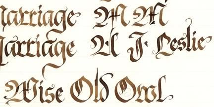
Thomas is an extraordinarily creative young man, as you can see from his website. I found the "callitype objects" in his virtual gallery particularly interesting. He is known in the calligraphic community more for his colorful ruling-pen demonstrations. His two-day class -- not a continuation of the Fraktur, but that ruling-pen technique -- was filled, although our Fraktur class only had half as many, eight people in it. Below, so you can see what I'm talking about, a sample from one of my practice sheets.
Vancouver Island is one of the best places I've ever been to: nearly as beautiful as Skye, but with excellent mild weather. The campus at Shawnigan Lake this year was pretty good -- a posh prep school that was the most handicapped-inaccessible institution I have ever seen, although the landscaping was lovely, the new dorms comfortable, staff enthusiastic hosts, and the food excellent.
This year I first had three days with Thomas Hoyer, studying a Fraktur hand. This is descended from medieval blackletter but has been elaborated into many typefaces, particularly in Germany, where books are traditionally printed in the style. A thick blackletter falls naturally from the broad-edge pen, and was the first thing I tried when I bought my first Speedball nib. I've spent a bit of time over the last mumble-mumble years practicing a primitive version of it, but this was something entirely new. I mean every stroke was different from the alphabets I've learned to write before. You're only fooling yourself to think you can learn a new alphabet in three days, but the first day we got through the entire lower-case, which was grueling. I had no muscle memory for this, and would frequently get lost in the middle of a letter, or even the middle of a stroke. It's not that often I get such a bad case of beginner's mind. Since beginner's mind is a much sought-after state in zen buddhism, this was not entirely a bad thing.
At the end of the third day, I was beginning to feel as though there were expressive details in this family of alphabets that Thomas could see, because he is native to that print culture, that I was entirely blind to, as though it were made of Japanese kanji characters in which I am an illiterate barbarian.
Thomas is an extraordinarily creative young man, as you can see from his website. I found the "callitype objects" in his virtual gallery particularly interesting. He is known in the calligraphic community more for his colorful ruling-pen demonstrations. His two-day class -- not a continuation of the Fraktur, but that ruling-pen technique -- was filled, although our Fraktur class only had half as many, eight people in it. Below, so you can see what I'm talking about, a sample from one of my practice sheets.
Subscribe to:
Posts (Atom)